Thursday, January 31, 2019

WINDOW DISPLAY DUE 2/14/2019

Analyze and name at least seven keys to window display success, and explain why you think they are important.  

- Find three 3 windows to analyze 
- You may choose any type of merchandise. 


  • Accessories
  • Pet Stores
  • Bridal
  • Men's
  • Children's
  • Any other type of retailing

- What is the theme conveyed in each presentation?

  • Refer to class discussions

- Discuss Brand Image:
  • Does the display align with the brand image?  Why or Why Not?


Deliverables:

1. Report your findings to class using a Slides (at least 7 - 10 slides).  Presentation should last three to five minutes.

 - Branding
 - Store Image
 - Color analysis
 - Composition
 - Fixtures, props, etc.
 - 3 Researched Sources

GO INTO DETAIL!

 - Create outline so you are not reading from slides
 - You cannot read from slides - POINTS WILL BE TAKEN OFF
 - Use MLA format for works cited.

2. Email complete presentation to me by 2/14/2019

We will work on this in class 2/7/2019

- Bring your laptops!

Tuesday, January 22, 2019

COLOR AND TEXTURE


PLEASE CLICK THE ABOVE LINK FOR INFORMATION AND REVIEW OF THE LESSON ON COLOR AND TEXTURE

“Color is the biggest motivation for shopping. People buy color before they buy size, fit or price”


Color Psychology

People react to color in some common ways.  However, individual responses can vary.

The display person will not be able to provide the ideal setting for each customer, but can satisfy the majority.

Yellow:

Sunshine, happy, bright, cheerful, fun, alive.  Spring, summer, Easter.
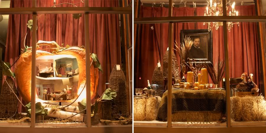
Orange:

Friendly, sociable, agreeable, glowing, exciting, vibrant and filled with anticipation.
Can be harsh or indicate danger.
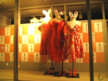
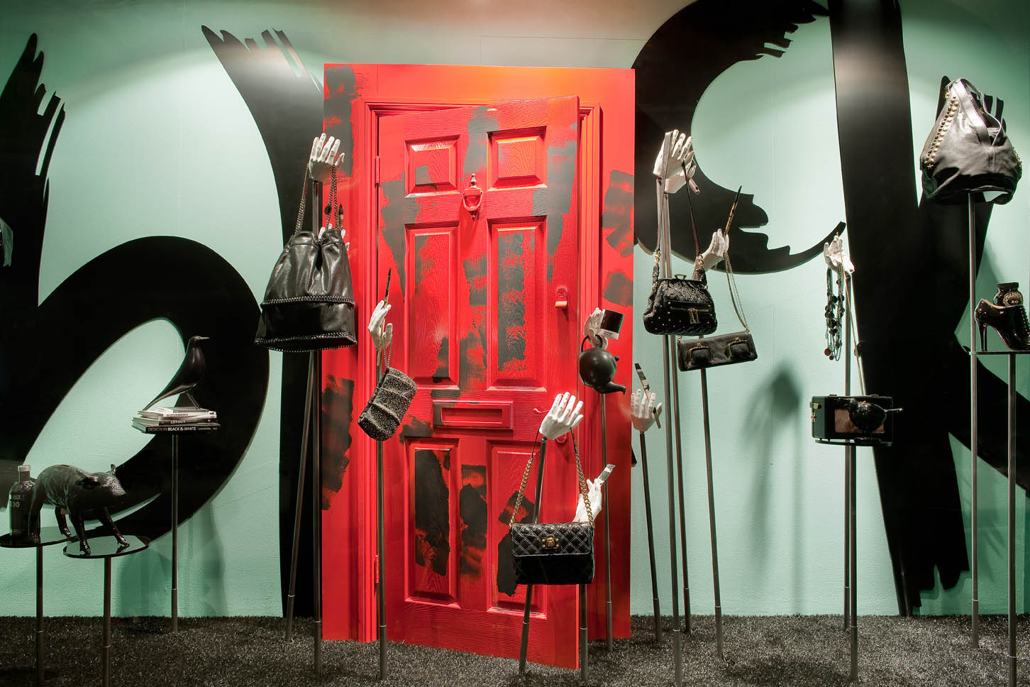
Red:

Exciting, stimulating, powerful and sexy. Strong and passionate. Valentine’s, Christmas, Patriotism.
Conveys “Sale.” Can also be warning or fire.

Pink:

Sweet, lovely, pretty, girly.  Mother’s Day, Easter, lingerie. Can seem insipid or fleshy.

Green:

Cool, alive, growing. Springtime, lawns, forests, eco-consciousness.  Good for St. Patrick’s Day or Christmas. Darker greens can be military, pale greens can look institutional.

Blue:

Most popular color. Cool, comfortable, calm. Skies, lakes, flags. Shadows on snow, home, summer water, flags.  It is quiet but can be moody or depressing.

Blue-green:

Cool, tasteful, sensitive and restful. Vital and alive, yet quiet. Water, sea, sky and grass.
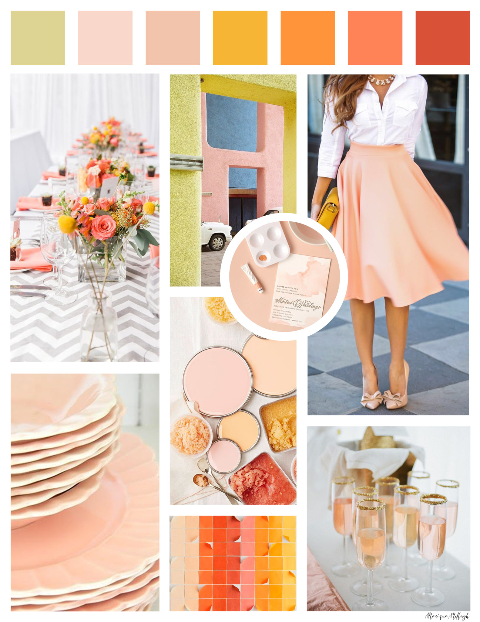
Peach:

The warmth and excitement of orange without the grating qualities. Smiling, glowing it is easy to be with and delightful to be in. A pastel earth tone.

Rust:

Full bodied, the warmth of orange but not irritating. The color of autumn.
Purple:
Traditionally regal, it is now associated with children – happy and youthful. In deeper tones it is taste, distinction. Can be overbearing or pompous.
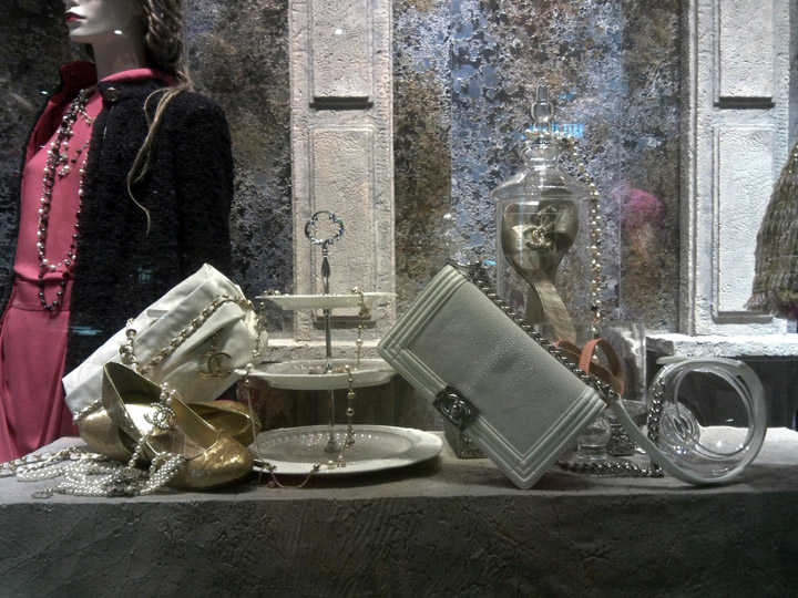
Gray:

Makes no statement and supports other colors well. Depressing or super-elegant and sophisticated.

Brown:

Earth, hearth, home, family, farm, wood, clay.  A warm nuetral that lets other colors step forward, but unlike gray, does not disappear.

White:

Blank, but supports other colors well, making them brighter. Innocence, hope, angels, summer, clarity. Can also seem stark or sterile.

Black:

Night, mystery, absence, sex, death, intrigue, sophistication.  Ultra-chic or ominous, it is a neutral that requires careful handling.

Color Families:

Warm – reds, yellows, oranges

Cool – greens, blues

Neutrals – Black, white, gray, brown

People of certain ages and types respond best to certain families. Elegant items show best against neutrals, while younger customers like warm brights.

Color Stories:

Analogous – create a close and pleasing harmony

Complementary – use with care and attention to proportion.

THE PANTONE WEBSITE   – HTTP://WWW.PANTONE.COM

COLOR TOOLS WEBSITE – HTTP://WWW.COLOURLOVERS.COM/

Tuesday, January 15, 2019

Creating the Color Story Mood Board...


  1. Think of a mood/theme/muse name and write it down (sometimes its ok to start with more than one)
    1. Write a story/poem/or song to support the theme of the mood - mount on the back of the board
  2. Using the mood/theme name you have selected, find images to support that mood.
    1. You can use search and save pictures to your flash drive, or you can cut them out of magazines.  You can also edit pictures in PhotoShop
    2. Go to www.colourlovers.com and create a color palette
    3. You can also create a palette with colored paint chips from any hardware store
  3. Print all of your images in color.
    1. There must be 3D elements to set the tone for the board
All your images, with your color swatches need to be presented on a board
    • 5 - 7 colors
  1. Bring in all images, board, scissors and glue on Thursday 1/17/2019 to work on in class.
  2. This assignment will be presented and critiqued 
  3. Name the mood of the board (Fluorescent Beach S/S 19)
  4. Place your name on the back of the board.


Below are some interesting moods from movie scenes - to help you develop your idea.

Image result for production design color pallets

Image result for production design color pallets

Image result for production design color pallets

Image result for production design color pallets

Image result for production design color pallets


Below are some examples of COLOR MOOD BOARDS.
Image result for color mood board

Image result for color mood board

Image result for color mood board

Image result for color mood board

WELCOME VISUAL MERCHANDISERS

WELCOME TO VISUAL MERCHANDISING...

- MY JOB IS TO STRENGTHEN YOUR KNOWLEDGE OF MERCHANDISING IN DISPLAY IN THE BILLION DOLLAR RETAIL INDUSTRY.

- YOUR JOB IS TO COMPLETE ALL ASSIGNMENTS ON TIME AND REMAIN OPEN TO ANY AND ALL INFORMATION GIVEN TO YOU.

 - ASK ALL QUESTIONS YOU CAN THINK OF - USE ME AS ONE OF THE MANY RESOURCES AVAILABLE TO YOU.

THIS BLOG WILL ALSO BE A SOURCE FOR ALL THE INFORMATION YOU WILL NEED TO COMPLETE THIS CLASS SUCCESSFULLY

See the source image